
I'm a BFA graduate, passionate about helping brands communicate their stories through design!
I'm a BFA graduate, passionate about helping brands communicate their stories through design!
UX Portfolio
UX Articles
Resume
Cleanse

Overview
A brand that has been in business for several years but decided to rebrand in order to better target their audience and improve their experience
Introduction
Although the brand has been in the market for 5 years, it was unable to appeal their target audience through e-commerce platforms as the product did not appear visually attractive to them. Unique approach was required in terms of logo and package design to increase the direct sales & influencer marketing
My Role
Brand Designer
Graphics Designer
Campaign Strategy
Tools
• Adobe Photoshop
• Adobe Illustrator
Responsiblities
• ideation
• Branding
• Logo Designing
• Brand Guidelines
• Analyzing user feedback
• Coordinating with project managers and stakeholders
Duration
3 Months
Problem Statement
While customers appreciated the taste of the juice, they had a hard time identifying the ingredients and nutritional value of each juice, which was a critical information that was not easily accessible on the old label design. This made it difficult for customers to make informed decisions about their purchases and also communicated a lack of transparency in the brand's ingredients.
Goals and Solution
• Unique logo design that represented brand vision
• Clear labels indicating the nutrition values of all different juices and blends
• Design that's more visually appealing to target audience

Design Process
01 User Research
The user research phase identified that while customers appreciated the taste of the juice, they had a hard time identifying the ingredients and nutritional value of each juice, which was a critical information that was not easily accessible on the old label design. Additionally, customers reported that the opaque white label on a glass bottle made it hard to see the juice inside and therefore, difficult to know what they were buying.
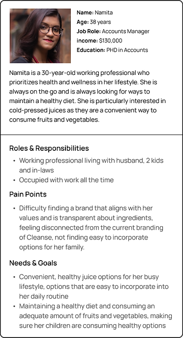
02 User Personas


Visual Design
One of the key components of the rebranding process was the redesign of the label for their juice bottles. The old label featured simple, clean typography and a plain white background. However, the company felt that this design did not effectively communicate the health and wellness benefits of their products to potential customers.
Logo Design
The new logo design was developed with the goal of creating a symbol that would represent the brand's commitment to natural and holistic wellness.
The design has three leaves on top of the text to form a lotus shape, which is a symbol of purity, enlightenment, self-regeneration, and rebirth.
The brand name font has been changed to a modern serif font, with the three leaves arranged on top of the text in a way that they form the shape of a lotus. The leaves are colored in shades of green, which is associated with health and natural.

Label Design
The new label has a transparent label material that would be applied directly to the glass bottle, creating a clean and minimalistic look, while allowing customers to see the juice inside.
It features simple typography in a bold font with a color code system to identify the different flavors and ingredients. A
Additionally, the new label includes a small section dedicated to list the ingredients and nutritional values of each juice, making it easy for customers to identify the contents of each juice and make informed decisions about their purchases.

User Testing
Customers were asked to evaluate the new label design and provide feedback on its usability and effectiveness. The feedback was overwhelmingly positive, with customers praising the new design for being more informative, visually appealing and transparent. They also appreciate the ability to see the juice inside the bottle which added more trust in the brand and the product.
Results
Cleanse has seen an increase in brand recognition and customer loyalty since the rebrand. The new logo design effectively communicates the brand's commitment to natural and holistic wellness and creates an emotional connection with the customers. Overall, Cleanse's rebranding and new logo design have been a success in improving the user experience and effectively reaching their target audience.


